# Core
## Table of Contents
1. [Gradle Dependency](#gradle-dependency)
2. [Basics](#basics)
3. [Customizing the Message](#customizing-the-message)
4. [Action Buttons](#action-buttons)
5. [Adding an Icon](#adding-an-icon)
6. [Callbacks](#callbacks)
7. [Dismissing](#dismissing)
8. [Lists](#lists)
1. [Plain](#plain)
2. [Single Choice](#single-choice)
3. [Multiple Choice](#multiple-choice)
4. [Custom Adapters](#custom-adapters)
9. [Checkbox Prompts](#checkbox-prompts)
10. [Custom Views](#custom-views)
11. [Miscellaneous](#miscellaneous)
12. [Theming](#theming)
1. [Light and Dark](#light-and-dark)
2. [Background Color](#background-color)
3. [Ripple Color](#ripple-color)
4. [Corner Radius](#corner-radius)
5. [Text Color](#text-color)
6. [Fonts](#fonts)
7. [Widget Color](#widget-color)
## Gradle Dependency
[  ](https://repo1.maven.org/maven2/com/afollestad/material-dialogs/core)
The `core` module contains everything you need to get started with the library. It contains all
core and normal-use functionality.
```gradle
dependencies {
...
implementation 'com.afollestad.material-dialogs:core:3.2.1'
}
```
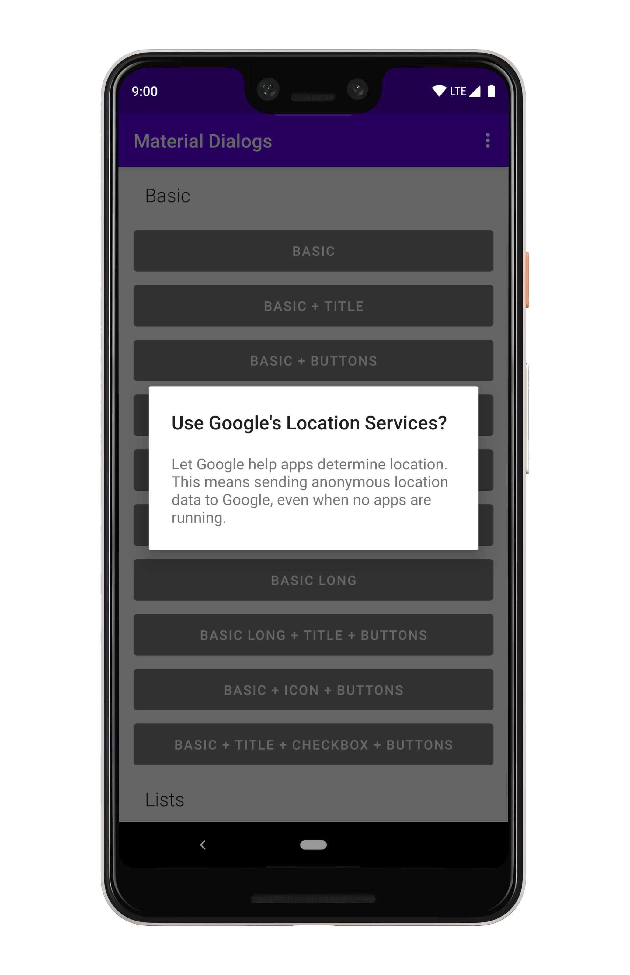
## Basics
Here's a very basic example of creating and showing a dialog:
 ```kotlin
MaterialDialog(this).show {
title(R.string.your_title)
message(R.string.your_message)
}
```
`this` should be a `Context` which is attached to a window, like an `Activity`.
If you wanted to pass in literal strings instead of string resources:
```kotlin
MaterialDialog(this).show {
title(text = "Your Title")
message(text = "Your Message")
}
```
Note that you can setup a dialog without immediately showing it, as well:
```kotlin
val dialog = MaterialDialog(this)
.title(R.string.your_title)
.message(R.string.your_message)
dialog.show()
```
## Customizing the Message
The `message` function lets you trail it with a lambda, which exposes certain built-in modifiers
along with allowing you to act on the `TextView` directly.
```kotlin
MaterialDialog(this).show {
...
message(R.string.your_message) {
html() // format, color, etc. with tags in string
html { link -> // same as above, but...
// Invokes a callback when a URL is clicked instead of auto opening it in a browser
}
lineSpacing(1.4f) // modifies line spacing, default is 1.0f
// You can directly act on the message TextView as well
val textView = messageTextView
}
}
```
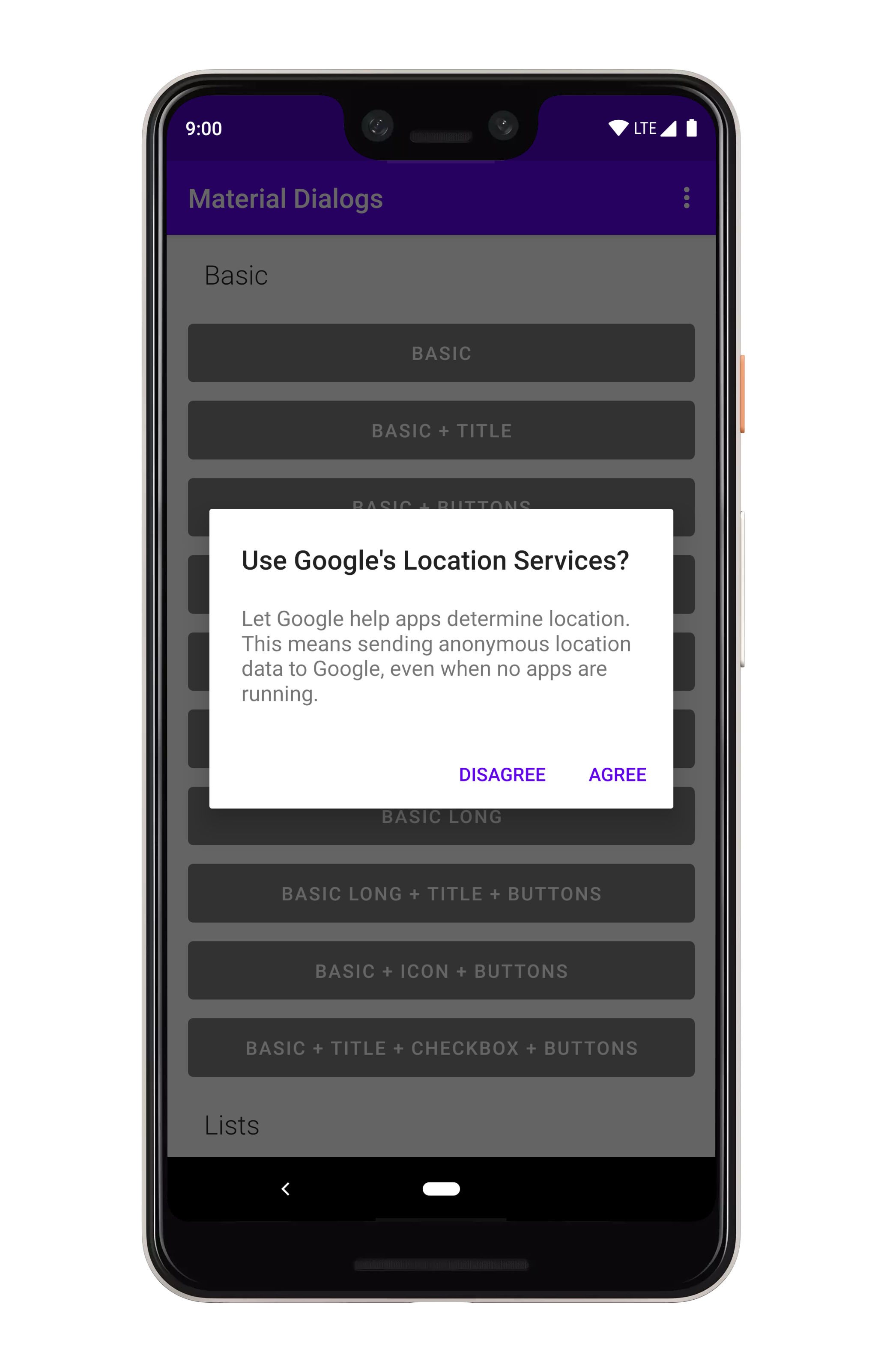
## Action Buttons
There are simple methods for adding action buttons:
```kotlin
MaterialDialog(this).show {
title(R.string.your_title)
message(R.string.your_message)
}
```
`this` should be a `Context` which is attached to a window, like an `Activity`.
If you wanted to pass in literal strings instead of string resources:
```kotlin
MaterialDialog(this).show {
title(text = "Your Title")
message(text = "Your Message")
}
```
Note that you can setup a dialog without immediately showing it, as well:
```kotlin
val dialog = MaterialDialog(this)
.title(R.string.your_title)
.message(R.string.your_message)
dialog.show()
```
## Customizing the Message
The `message` function lets you trail it with a lambda, which exposes certain built-in modifiers
along with allowing you to act on the `TextView` directly.
```kotlin
MaterialDialog(this).show {
...
message(R.string.your_message) {
html() // format, color, etc. with tags in string
html { link -> // same as above, but...
// Invokes a callback when a URL is clicked instead of auto opening it in a browser
}
lineSpacing(1.4f) // modifies line spacing, default is 1.0f
// You can directly act on the message TextView as well
val textView = messageTextView
}
}
```
## Action Buttons
There are simple methods for adding action buttons:
 ```kotlin
MaterialDialog(this).show {
positiveButton(R.string.agree)
negativeButton(R.string.disagree)
}
```
You can use literal strings here as well:
```kotlin
MaterialDialog(this).show {
positiveButton(text = "Agree")
negativeButton(text = "Disagree")
}
```
---
Listening for clicks on the buttons is as simple as adding a lambda to the end:
```kotlin
MaterialDialog(this).show {
positiveButton(R.string.agree) { dialog ->
// Do something
}
negativeButton(R.string.disagree) { dialog ->
// Do something
}
}
```
If action buttons together are too long to fit in the dialog's width, they will be automatically
stacked:
```kotlin
MaterialDialog(this).show {
positiveButton(R.string.agree)
negativeButton(R.string.disagree)
}
```
You can use literal strings here as well:
```kotlin
MaterialDialog(this).show {
positiveButton(text = "Agree")
negativeButton(text = "Disagree")
}
```
---
Listening for clicks on the buttons is as simple as adding a lambda to the end:
```kotlin
MaterialDialog(this).show {
positiveButton(R.string.agree) { dialog ->
// Do something
}
negativeButton(R.string.disagree) { dialog ->
// Do something
}
}
```
If action buttons together are too long to fit in the dialog's width, they will be automatically
stacked:
 ## Adding an Icon
You can display an icon to the left of the title:
## Adding an Icon
You can display an icon to the left of the title:
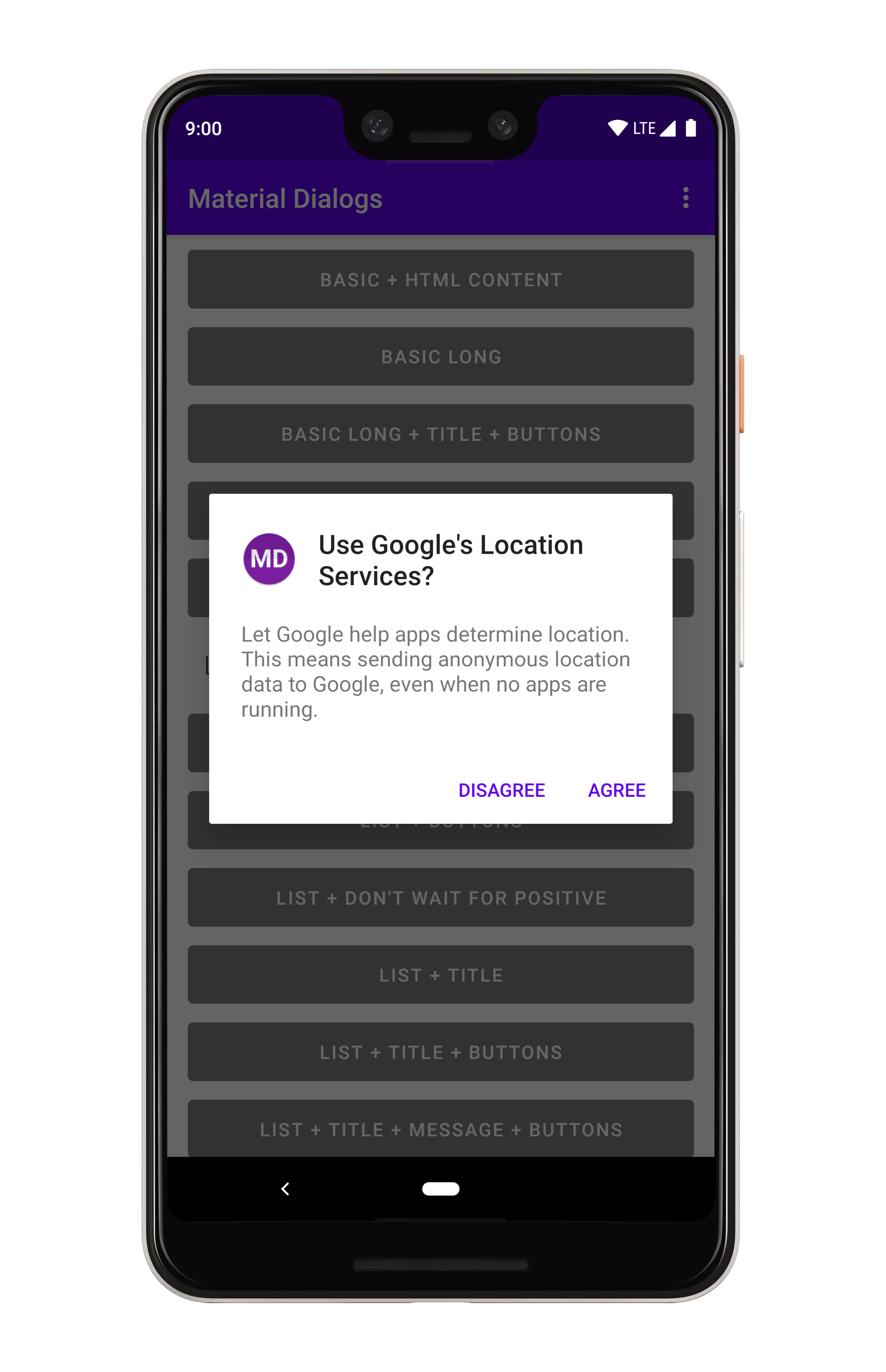 ```kotlin
MaterialDialog(this).show {
icon(R.drawable.your_icon)
}
```
You can pass a Drawable instance as well:
```kotlin
val myDrawable: Drawable = // ...
MaterialDialog(this).show {
icon(drawable = myDrawable)
}
```
## Callbacks
There are a few lifecycle callbacks you can hook into:
```kotlin
MaterialDialog(this).show {
onPreShow { dialog -> }
onShow { dialog -> }
onDismiss { dialog -> }
onCancel { dialog -> }
}
```
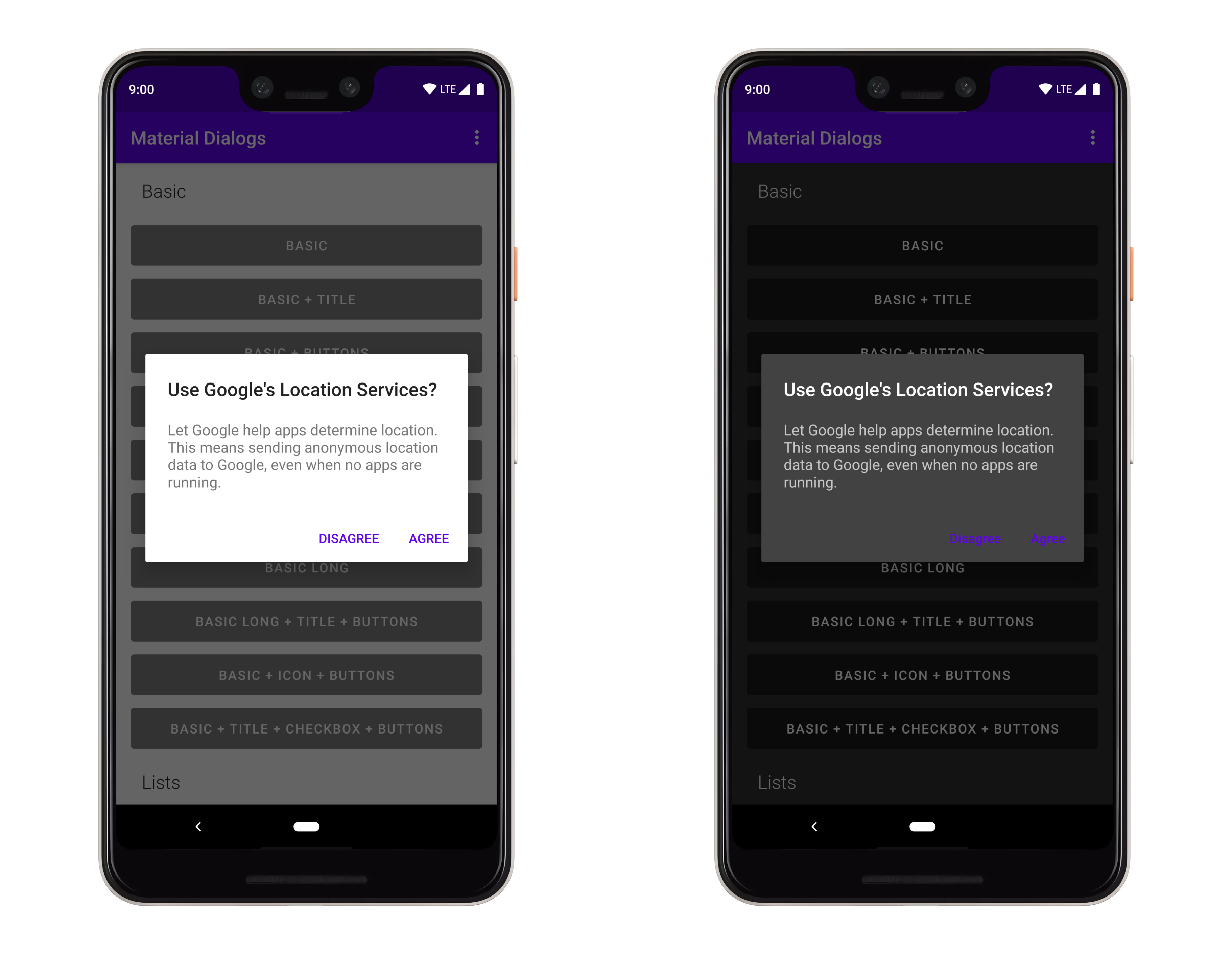
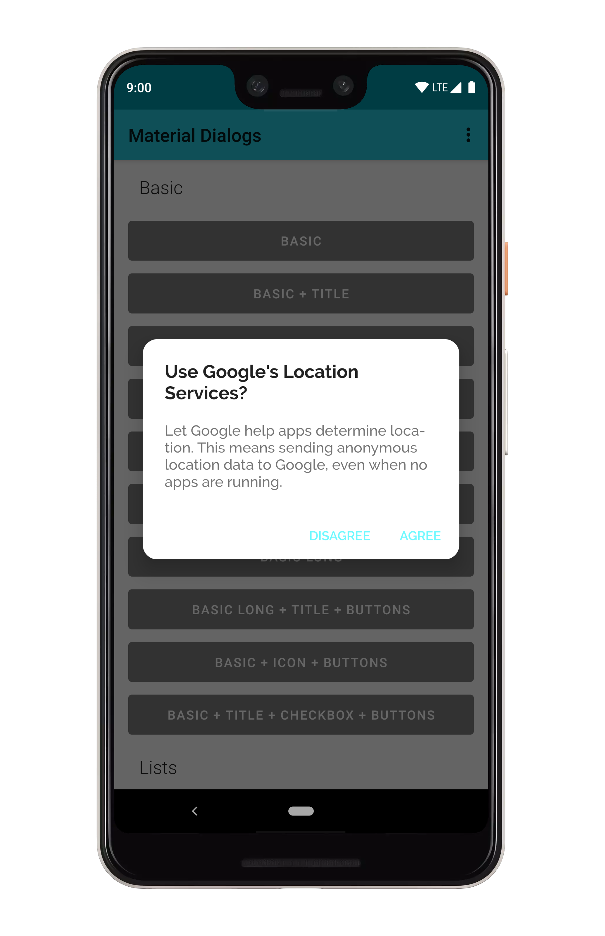
## Dismissing
Dismissing a dialog closes it, it's just a simple method inherited from the parent `Dialog` class:
```kotlin
val dialog: MaterialDialog = // ...
dialog.dismiss()
```
---
You can prevent a dialog from being canceled, meaning it has to be explictly dismissed with an
action button or a call to the method above.
```kotlin
MaterialDialog(this).show {
cancelable(false) // calls setCancelable on the underlying dialog
cancelOnTouchOutside(false) // calls setCanceledOnTouchOutside on the underlying dialog
}
```
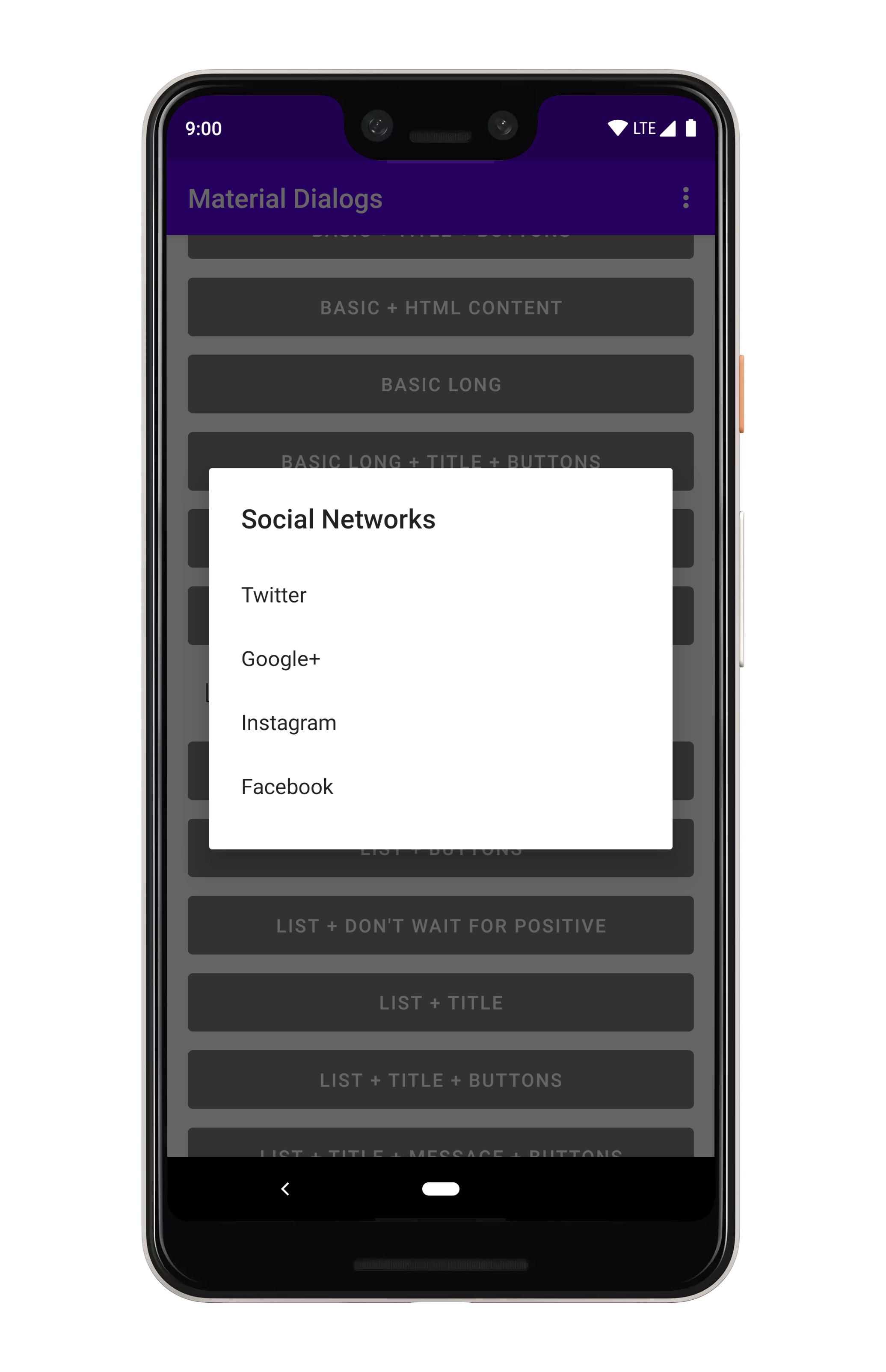
## Lists
### Plain
You can show lists using the `listItems` extension on `MaterialDialog`:
```kotlin
MaterialDialog(this).show {
icon(R.drawable.your_icon)
}
```
You can pass a Drawable instance as well:
```kotlin
val myDrawable: Drawable = // ...
MaterialDialog(this).show {
icon(drawable = myDrawable)
}
```
## Callbacks
There are a few lifecycle callbacks you can hook into:
```kotlin
MaterialDialog(this).show {
onPreShow { dialog -> }
onShow { dialog -> }
onDismiss { dialog -> }
onCancel { dialog -> }
}
```
## Dismissing
Dismissing a dialog closes it, it's just a simple method inherited from the parent `Dialog` class:
```kotlin
val dialog: MaterialDialog = // ...
dialog.dismiss()
```
---
You can prevent a dialog from being canceled, meaning it has to be explictly dismissed with an
action button or a call to the method above.
```kotlin
MaterialDialog(this).show {
cancelable(false) // calls setCancelable on the underlying dialog
cancelOnTouchOutside(false) // calls setCanceledOnTouchOutside on the underlying dialog
}
```
## Lists
### Plain
You can show lists using the `listItems` extension on `MaterialDialog`:
 ```kotlin
MaterialDialog(this).show {
listItems(R.array.socialNetworks)
}
```
You can pass a literal string array too:
```kotlin
val myItems = listOf("Hello", "World")
MaterialDialog(this).show {
listItems(items = myItems)
}
```
To get item selection events, just append a lambda:
```kotlin
MaterialDialog(this).show {
listItems(R.array.socialNetworks) { dialog, index, text ->
// Invoked when the user taps an item
}
}
```
### Single Choice
You can show single choice (radio button) lists using the `listItemsSingleChoice` extension
on `MaterialDialog`:
```kotlin
MaterialDialog(this).show {
listItems(R.array.socialNetworks)
}
```
You can pass a literal string array too:
```kotlin
val myItems = listOf("Hello", "World")
MaterialDialog(this).show {
listItems(items = myItems)
}
```
To get item selection events, just append a lambda:
```kotlin
MaterialDialog(this).show {
listItems(R.array.socialNetworks) { dialog, index, text ->
// Invoked when the user taps an item
}
}
```
### Single Choice
You can show single choice (radio button) lists using the `listItemsSingleChoice` extension
on `MaterialDialog`:
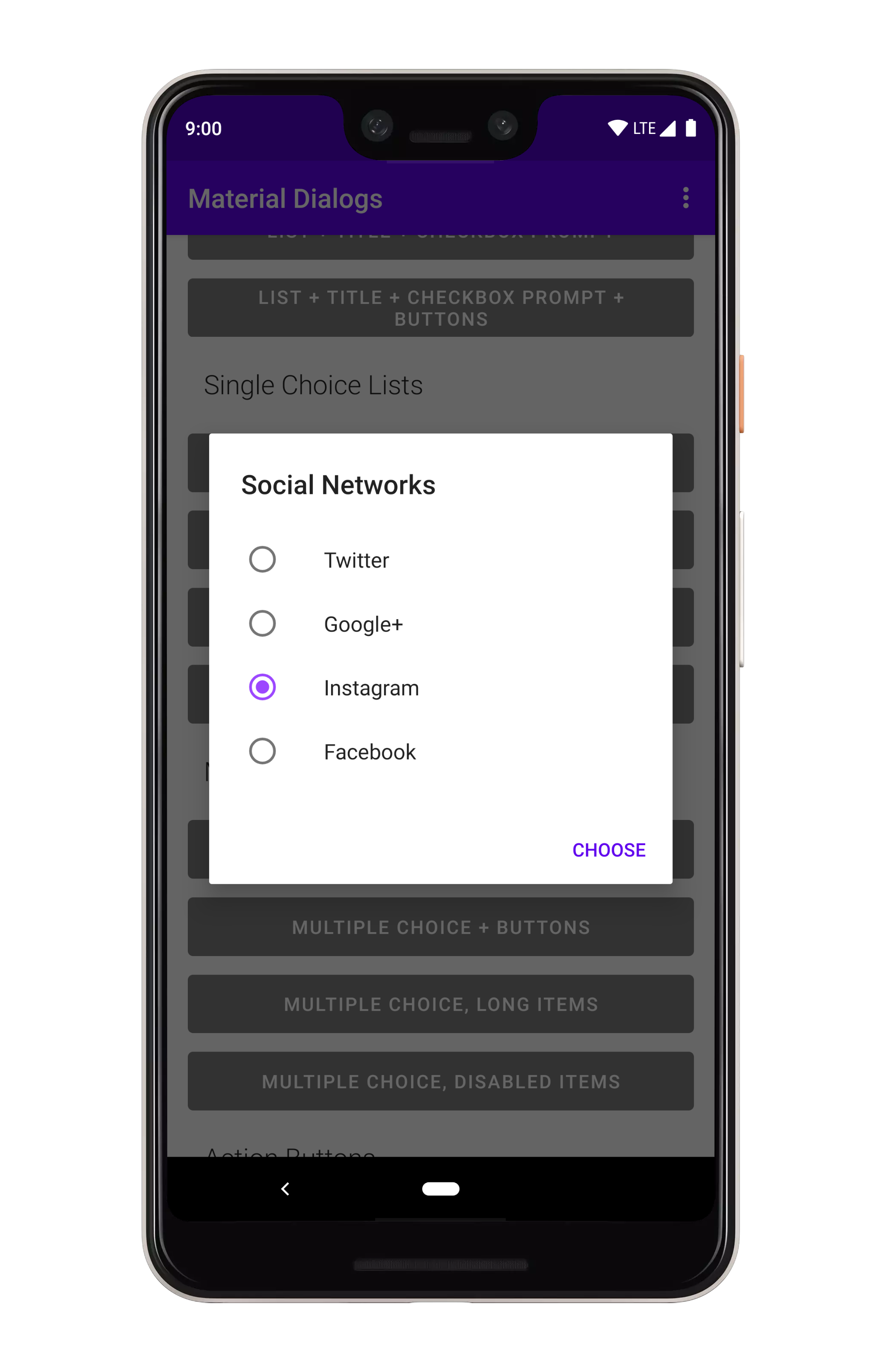 ```kotlin
MaterialDialog(this).show {
listItemsSingleChoice(R.array.my_items)
}
```
You can pass a literal string array too:
```kotlin
val myItems = listOf("Hello", "World")
MaterialDialog(this).show {
listItemsSingleChoice(items = myItems)
}
```
---
If you want an option to be selected when the dialog opens, you can pass an `initialSelection` index):
```kotlin
MaterialDialog(this).show {
listItemsSingleChoice(R.array.my_items, initialSelection = 1)
}
```
To get item selection events, just append a lambda:
```kotlin
MaterialDialog(this).show {
listItemsSingleChoice(R.array.my_items) { dialog, index, text ->
// Invoked when the user selects an item
}
}
```
Without action buttons, the selection callback is invoked immediately when the user taps an item. If
you add a positive action button...
```kotlin
MaterialDialog(this).show {
listItemsSingleChoice(R.array.my_items) { dialog, index, text ->
// Invoked when the user selects an item
}
positiveButton(R.string.select)
}
```
...then the callback isn't invoked until the user selects an item *and* taps the positive action
button. You can override that behavior using the `waitForPositiveButton` argument.
An added bonus, you can disable items from being selected/unselected:
```kotlin
val indices = intArrayOf(0, 2)
MaterialDialog(this).show {
listItemsSingleChoice(R.array.my_items, disabledIndices = indices)
}
```
---
There are methods you can use in a built dialog to modify checked states:
```kotlin
val dialog: MaterialDialog = // ...
dialog.checkItem(index)
dialog.uncheckItem(index)
dialog.toggleItemChecked(index)
val checked: Boolean = dialog.isItemChecked(index)
```
### Multiple Choice
You can show multiple choice (checkbox) lists using the `listItemsMultiChoice` extension on `MaterialDialog`:
```kotlin
MaterialDialog(this).show {
listItemsSingleChoice(R.array.my_items)
}
```
You can pass a literal string array too:
```kotlin
val myItems = listOf("Hello", "World")
MaterialDialog(this).show {
listItemsSingleChoice(items = myItems)
}
```
---
If you want an option to be selected when the dialog opens, you can pass an `initialSelection` index):
```kotlin
MaterialDialog(this).show {
listItemsSingleChoice(R.array.my_items, initialSelection = 1)
}
```
To get item selection events, just append a lambda:
```kotlin
MaterialDialog(this).show {
listItemsSingleChoice(R.array.my_items) { dialog, index, text ->
// Invoked when the user selects an item
}
}
```
Without action buttons, the selection callback is invoked immediately when the user taps an item. If
you add a positive action button...
```kotlin
MaterialDialog(this).show {
listItemsSingleChoice(R.array.my_items) { dialog, index, text ->
// Invoked when the user selects an item
}
positiveButton(R.string.select)
}
```
...then the callback isn't invoked until the user selects an item *and* taps the positive action
button. You can override that behavior using the `waitForPositiveButton` argument.
An added bonus, you can disable items from being selected/unselected:
```kotlin
val indices = intArrayOf(0, 2)
MaterialDialog(this).show {
listItemsSingleChoice(R.array.my_items, disabledIndices = indices)
}
```
---
There are methods you can use in a built dialog to modify checked states:
```kotlin
val dialog: MaterialDialog = // ...
dialog.checkItem(index)
dialog.uncheckItem(index)
dialog.toggleItemChecked(index)
val checked: Boolean = dialog.isItemChecked(index)
```
### Multiple Choice
You can show multiple choice (checkbox) lists using the `listItemsMultiChoice` extension on `MaterialDialog`:
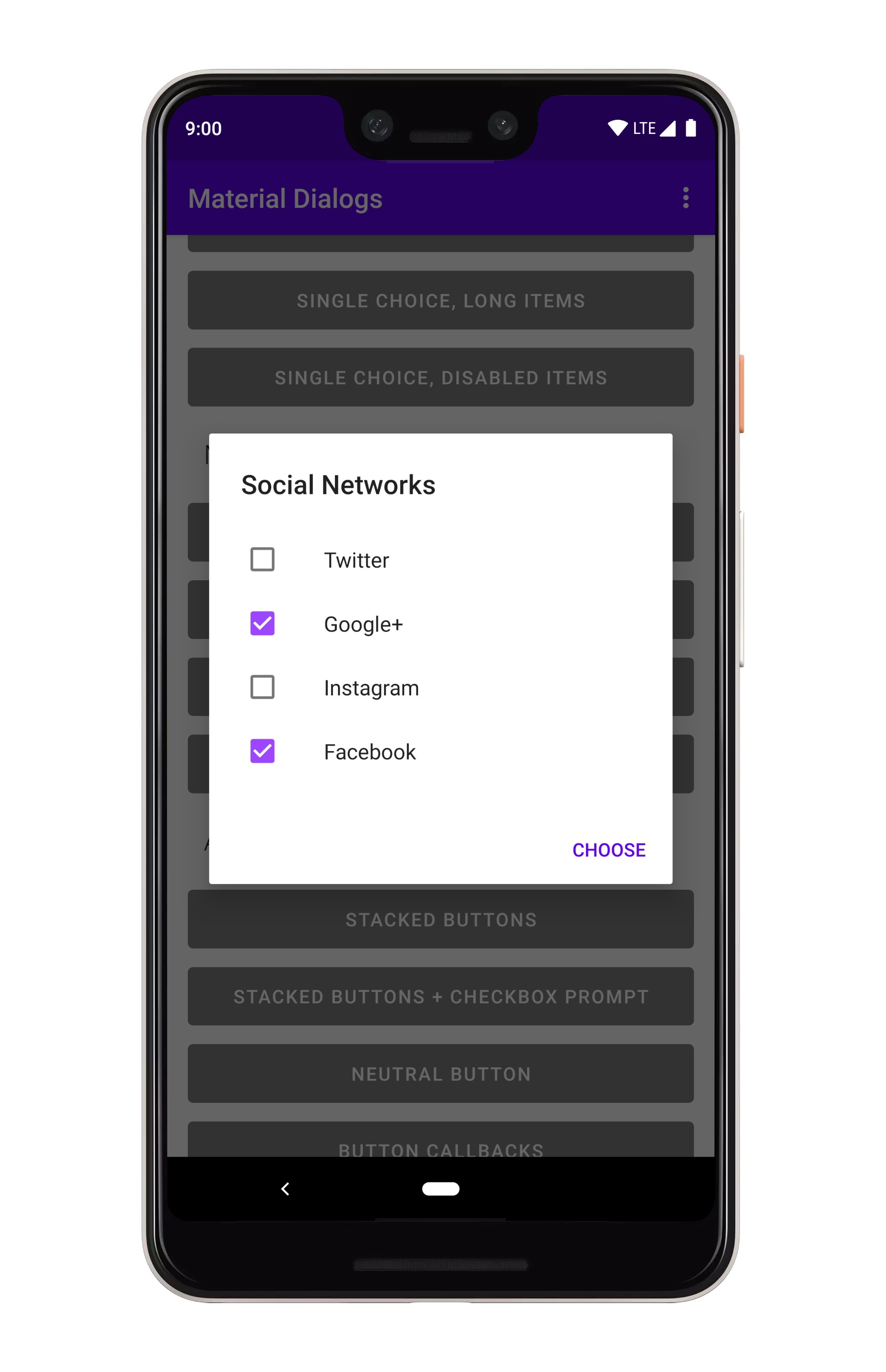 ```kotlin
MaterialDialog(this).show {
listItemsMultiChoice(R.array.my_items) { _, index, text ->
// Invoked when the user selects item(s)
}
}
```
You can pass a literal string array too:
```kotlin
val myItems = listOf("Hello", "World")
MaterialDialog(this).show {
listItemsMultiChoice(items = myItems)
}
```
---
If you want option(s) to be selected when the dialog opens, you can pass an `initialSelection` index):
```kotlin
val indices = intArrayOf(1, 3)
MaterialDialog(this).show {
listItemsMultiChoice(R.array.my_items, initialSelection = indices)
}
```
To get item selection events, just append a lambda:
```kotlin
MaterialDialog(this).show {
listItemsMultiChoice(R.array.my_items) { dialog, indices, items ->
// Invoked when the user selects an item
}
}
```
Without action buttons, the selection callback is invoked immediately when the user taps an item. If
you add a positive action button...
```kotlin
MaterialDialog(this).show {
listItemsMultiChoice(R.array.my_items) { dialog, indices, items ->
// Invoked when the user selects an item
}
positiveButton(R.string.select)
}
```
...then the callback isn't invoked until the user select one or more items *and* taps the positive
action button. You can override that behavior using the `waitForPositiveButton` argument.
An added bonus, you can disable items from being selected/unselected:
```kotlin
val indices = intArrayOf(0, 2)
MaterialDialog(this).show {
listItemsMultiChoice(R.array.my_items, disabledIndices = indices)
}
```
---
There are methods you can use in a built dialog to modify checked states:
```kotlin
val dialog: MaterialDialog = // ...
val indices: IntArray = // ...
dialog.checkItems(indices)
dialog.uncheckItems(indices)
dialog.toggleItemsChecked(indices)
dialog.checkAllItems()
dialog.uncheckAllItems()
dialog.toggleAllItemsChecked()
val checked: Boolean = dialog.isItemChecked(index)
```
### Custom Adapters
If you want to customize lists to use your own views, you need to use a custom adapter.
```kotlin
val adapter: RecyclerView.Adapter<*> = // some sort of adapter implementation...
MaterialDialog(this).show {
customListAdapter(adapter)
}
```
You can retrieve your adapter again later from the dialog instance:
```kotlin
val dialog: MaterialDialog = // ...
val adapter: RecyclerView.Adapter<*> = dialog.getListAdapter()
```
You can also retrieve the `RecyclerView` that the adapter is hosted in:
```kotlin
val dialog: MaterialDialog = // ...
val recyclerView: RecyclerView = dialog.getRecyclerView()
```
## Checkbox Prompts
Checkbox prompts can be used together with any other dialog type, it gets shown in the same view
which shows the action buttons.
```kotlin
MaterialDialog(this).show {
listItemsMultiChoice(R.array.my_items) { _, index, text ->
// Invoked when the user selects item(s)
}
}
```
You can pass a literal string array too:
```kotlin
val myItems = listOf("Hello", "World")
MaterialDialog(this).show {
listItemsMultiChoice(items = myItems)
}
```
---
If you want option(s) to be selected when the dialog opens, you can pass an `initialSelection` index):
```kotlin
val indices = intArrayOf(1, 3)
MaterialDialog(this).show {
listItemsMultiChoice(R.array.my_items, initialSelection = indices)
}
```
To get item selection events, just append a lambda:
```kotlin
MaterialDialog(this).show {
listItemsMultiChoice(R.array.my_items) { dialog, indices, items ->
// Invoked when the user selects an item
}
}
```
Without action buttons, the selection callback is invoked immediately when the user taps an item. If
you add a positive action button...
```kotlin
MaterialDialog(this).show {
listItemsMultiChoice(R.array.my_items) { dialog, indices, items ->
// Invoked when the user selects an item
}
positiveButton(R.string.select)
}
```
...then the callback isn't invoked until the user select one or more items *and* taps the positive
action button. You can override that behavior using the `waitForPositiveButton` argument.
An added bonus, you can disable items from being selected/unselected:
```kotlin
val indices = intArrayOf(0, 2)
MaterialDialog(this).show {
listItemsMultiChoice(R.array.my_items, disabledIndices = indices)
}
```
---
There are methods you can use in a built dialog to modify checked states:
```kotlin
val dialog: MaterialDialog = // ...
val indices: IntArray = // ...
dialog.checkItems(indices)
dialog.uncheckItems(indices)
dialog.toggleItemsChecked(indices)
dialog.checkAllItems()
dialog.uncheckAllItems()
dialog.toggleAllItemsChecked()
val checked: Boolean = dialog.isItemChecked(index)
```
### Custom Adapters
If you want to customize lists to use your own views, you need to use a custom adapter.
```kotlin
val adapter: RecyclerView.Adapter<*> = // some sort of adapter implementation...
MaterialDialog(this).show {
customListAdapter(adapter)
}
```
You can retrieve your adapter again later from the dialog instance:
```kotlin
val dialog: MaterialDialog = // ...
val adapter: RecyclerView.Adapter<*> = dialog.getListAdapter()
```
You can also retrieve the `RecyclerView` that the adapter is hosted in:
```kotlin
val dialog: MaterialDialog = // ...
val recyclerView: RecyclerView = dialog.getRecyclerView()
```
## Checkbox Prompts
Checkbox prompts can be used together with any other dialog type, it gets shown in the same view
which shows the action buttons.
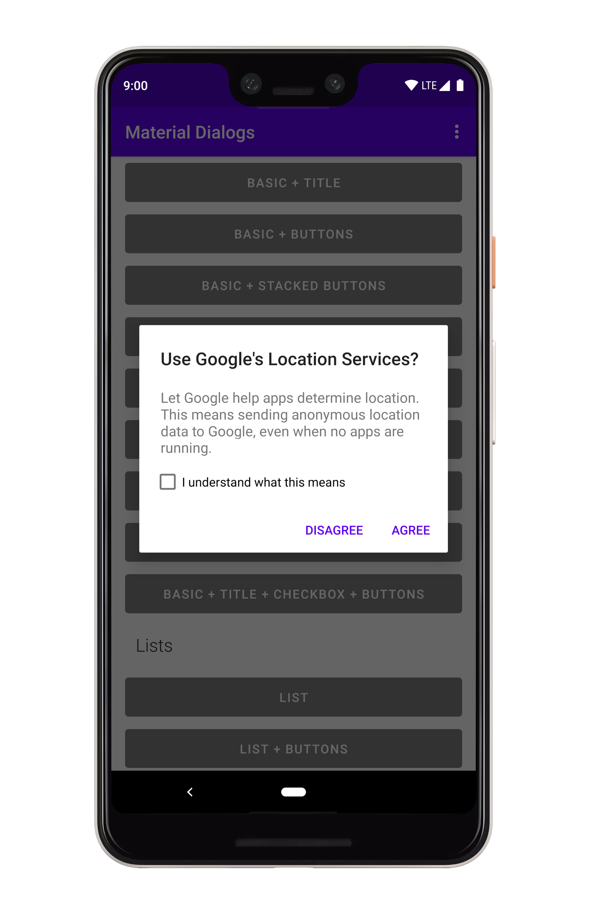 ```kotlin
MaterialDialog(this).show {
checkBoxPrompt(R.string.your_label) { checked ->
// Check box was checked or unchecked
}
}
```
You can pass a literal string for the label too:
```kotlin
MaterialDialog(this).show {
checkBoxPrompt(text = "Hello, World")
}
```
---
You can also append a lambda which gets invoked when the checkbox is checked or unchecked:
```kotlin
MaterialDialog(this).show {
checkBoxPrompt(text = "Hello, World") { checked -> }
}
```
If you only care about the checkbox state when the positive action button is pressed:
```kotlin
MaterialDialog(this).show {
checkBoxPrompt(R.string.your_label)
positiveButton(R.string.button_text) { dialog ->
val isChecked = dialog.isCheckPromptChecked()
// do something
}
}
```
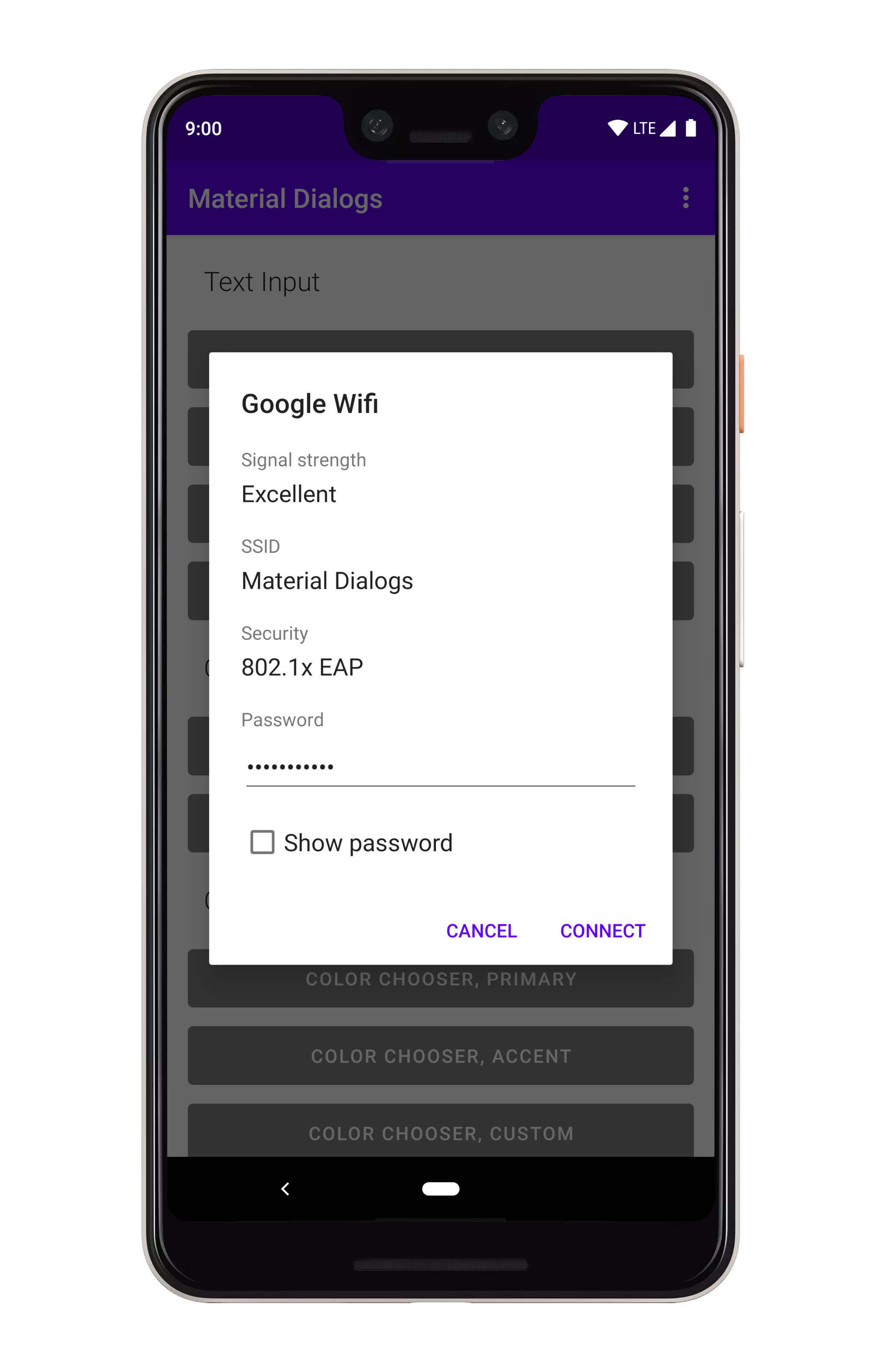
## Custom Views
A lot of the included extensions use custom views, such as the color chooser dialog. There's also
a simple example in the sample project.
```kotlin
MaterialDialog(this).show {
checkBoxPrompt(R.string.your_label) { checked ->
// Check box was checked or unchecked
}
}
```
You can pass a literal string for the label too:
```kotlin
MaterialDialog(this).show {
checkBoxPrompt(text = "Hello, World")
}
```
---
You can also append a lambda which gets invoked when the checkbox is checked or unchecked:
```kotlin
MaterialDialog(this).show {
checkBoxPrompt(text = "Hello, World") { checked -> }
}
```
If you only care about the checkbox state when the positive action button is pressed:
```kotlin
MaterialDialog(this).show {
checkBoxPrompt(R.string.your_label)
positiveButton(R.string.button_text) { dialog ->
val isChecked = dialog.isCheckPromptChecked()
// do something
}
}
```
## Custom Views
A lot of the included extensions use custom views, such as the color chooser dialog. There's also
a simple example in the sample project.
 ```kotlin
MaterialDialog(this).show {
customView(R.layout.my_custom_view)
}
```
You can also pass a literal view:
```kotlin
val myView: View = // ...
MaterialDialog(this).show {
customView(view = myView)
}
```
If your custom view may be taller than the dialog, you'll want to make it scrollable:
```kotlin
MaterialDialog(this).show {
customView(R.layout.my_custom_view, scrollable = true)
}
```
For later access, you can use `dialog.getCustomView()`:
```kotlin
val dialog = MaterialDialog(this)
.customView(R.layout.my_custom_view, scrollable = true)
val customView = dialog.getCustomView()
// Use the view instance, e.g. to set values or setup listeners
dialog.show()
```
## Miscellaneous
There are little details which are easy to miss. For an example, auto dismiss controls whether pressing
the action buttons or tapping a list item will automatically dismiss the dialog or not. By default,
it's turned on. You can disable it:
```kotlin
MaterialDialog(this).show {
noAutoDismiss()
}
```
## Theming
Google's newer mindset with Material Theming (vs the 2014 mindset) is flexible. If you take their
["Crane example"](https://material.io/design/components/dialogs.html#theming), you see that they
change fonts, corner rounding, etc.
### Light and Dark
Light and dark theming is automatic based on your app's theme (basically whether `android:textColorPrimary`
is more light or more dark):
```kotlin
MaterialDialog(this).show {
customView(R.layout.my_custom_view)
}
```
You can also pass a literal view:
```kotlin
val myView: View = // ...
MaterialDialog(this).show {
customView(view = myView)
}
```
If your custom view may be taller than the dialog, you'll want to make it scrollable:
```kotlin
MaterialDialog(this).show {
customView(R.layout.my_custom_view, scrollable = true)
}
```
For later access, you can use `dialog.getCustomView()`:
```kotlin
val dialog = MaterialDialog(this)
.customView(R.layout.my_custom_view, scrollable = true)
val customView = dialog.getCustomView()
// Use the view instance, e.g. to set values or setup listeners
dialog.show()
```
## Miscellaneous
There are little details which are easy to miss. For an example, auto dismiss controls whether pressing
the action buttons or tapping a list item will automatically dismiss the dialog or not. By default,
it's turned on. You can disable it:
```kotlin
MaterialDialog(this).show {
noAutoDismiss()
}
```
## Theming
Google's newer mindset with Material Theming (vs the 2014 mindset) is flexible. If you take their
["Crane example"](https://material.io/design/components/dialogs.html#theming), you see that they
change fonts, corner rounding, etc.
### Light and Dark
Light and dark theming is automatic based on your app's theme (basically whether `android:textColorPrimary`
is more light or more dark):
 ### Background Color
Material Dialogs uses the value of the `colorBackgroundFloating` attribute in your Activity theme
for the background color of dialogs. You can also use the `md_background_color` attribute in your
theme, which will take precedence.
### Ripple Color
Material Dialogs uses the value of the `?android:colorControlHighlight` attribute in your Activity
theme for the ripple color of list items, buttons, etc. by default. You can override this with the
`md_ripple_color` theme attribute as well.
### Corner Radius
Corner radius is the rounding of dialog corners:
### Background Color
Material Dialogs uses the value of the `colorBackgroundFloating` attribute in your Activity theme
for the background color of dialogs. You can also use the `md_background_color` attribute in your
theme, which will take precedence.
### Ripple Color
Material Dialogs uses the value of the `?android:colorControlHighlight` attribute in your Activity
theme for the ripple color of list items, buttons, etc. by default. You can override this with the
`md_ripple_color` theme attribute as well.
### Corner Radius
Corner radius is the rounding of dialog corners:
 it can be changed with an attribute in your app theme. It defaults to 4dp:
```xml
```
There is also a programmatic setter for this value:
```kotlin
MaterialDialog(this).show {
// literal, internally converts to dp so 16dp
cornerRadius(16f)
// Using a dimen instead is encouraged as it's easier to have all instances changeable from one place
cornerRadius(res = R.dimen.my_corner_radius)
}
```
### Text Color
By default, `android:textColorPrimary` and `android:textColorSecondary` attributes from your Activity
theme are used for the title and content colors of dialogs. `colorPrimary` is used for the default
text color of action buttons. If you wish to override these, there are attributes provided:
```xml
```
### Fonts
This library supports using custom fonts, powered by the Support libraries `ResourcesCompat` class.
With raw font files or XML font files in your `/res/font` folder, you can use them in Material Dialogs
using attributes in your app's theme.
```xml
```
See the "Custom Theme" example in the sample project (open the overflow menu for the theme switcher).
it can be changed with an attribute in your app theme. It defaults to 4dp:
```xml
```
There is also a programmatic setter for this value:
```kotlin
MaterialDialog(this).show {
// literal, internally converts to dp so 16dp
cornerRadius(16f)
// Using a dimen instead is encouraged as it's easier to have all instances changeable from one place
cornerRadius(res = R.dimen.my_corner_radius)
}
```
### Text Color
By default, `android:textColorPrimary` and `android:textColorSecondary` attributes from your Activity
theme are used for the title and content colors of dialogs. `colorPrimary` is used for the default
text color of action buttons. If you wish to override these, there are attributes provided:
```xml
```
### Fonts
This library supports using custom fonts, powered by the Support libraries `ResourcesCompat` class.
With raw font files or XML font files in your `/res/font` folder, you can use them in Material Dialogs
using attributes in your app's theme.
```xml
```
See the "Custom Theme" example in the sample project (open the overflow menu for the theme switcher).